A parallel coordinate system is constructed by embedding a set of parallel axes into a Cartesian coordinate system. Multidimensional points are represented by lines intersecting the parallel axes at the respective coordinates. If you draw a straight line for each point and each pair of axes, you get the dashed lines in the figure. Normally only the part between adjacent axes is actually rendered, so that for each multidimensional point a polyline is created (represented by the thick black line in Fig. 1.).
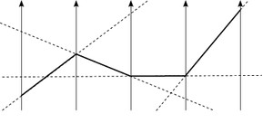
Fig. 1: Constructing parallel coordinates
Parallel Coordinates Matrix
The order of the axes has a great influence on the appearance of patterns when constructing a parallel coordinate plot. Similar to the scatterplot matrix (SPLOM), a parallel coordinate diagram visualizes a series of two-dimensional relationships between each pair of adjacent axes. A common approach to help the user determine a "good" order of dimensions is to evaluate pairs of diagrams, e.g. with a correlation meter.
The parallel-coordinates matrix (PCM) is uses the same approach as the scatterplot matrix: Show all pairwise relations. In contrast to the SPLOM, the PCM doesn't use a matrix-layout but effectively displays as list of parallel-coordinate plots with different axis orderings. Each of the single plots shows all dimensions of the data and all plots together show all pairwise relations. For more information, see the publication below or download the accompanying video here.
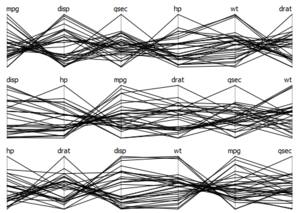
Abb. 2: Parallel Coordinates Matrix mit sechs Dimensionen des Cars-Datensatzes.
Continuous Parallel Coordinates
 |
 |
|
|
 |
 |
|
|
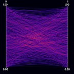
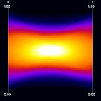
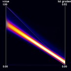
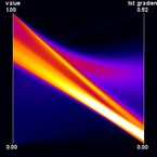
Continuous Parallel Coordinates visualize the density of lines instead of rendering "discrete" lines. This is particularly useful for large datasets where heavy overplotting might occur with the traditional approach. Ed Wegman provided such a line-density model for normally distributed data as early as 1991. In our work, we use a different density model which is applicable to any bivariate density distribution. Continuous Parallel Coordinates basically transform densities from a continuous 2D scatterplot to 2D parallel coordinates (i.e. with 2 axes) exploiting the point-line duality between Cartesian and parallel coordinates. Figure 1 shows an artificial dataset that was created on a 3-D grid with spatial resolution 10 x 10 x 10. For each voxel, two values were randomly drawn from a gaussian distribution. Figure 2 shows the corresponding continuous version. Figures 3 and 4 show a dataset that comprises a CT scan of a tooth with resolution 128 x 128 x 160. In addition to the value contained in the dataset, the gradient was computed at each voxel position. In this example, the sampling artifacts may lead to misinterpretation in the discrete parallel coordinates plot. First, there seems to exist a dense (white) region on the first dimension, which is not existent in continuous parallel coordinates. Second, a large number of values equal to one in the first dimension with a zero-length gradient are mapped to the same line, resulting in a visually striking peak in the density distribution. Again, this peak does not occur in continuous parallel coordinates. Finally, samples at "empty" regions which may be classified as background noise are naturally removed by continuous parallel coordinates.
Bundled Parallel Coordinates
 |
 |
|
|
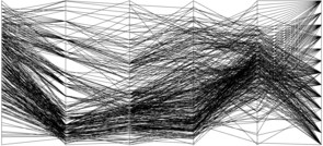
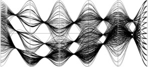
A common way to visualize categorical data in parallel coordinates is to color each line by the class or category it belongs to. In many cases, such classes represent clusters of "similar" datapoints. Another technique that relies on geometry only is to employ bundling. Here, data samples are rendered as curves instead of lines. Then, all curves belonging to the same class or cluster are "bundled" together midway between adjacent axes. Bundles are easier to visually trace over all dimensions while retaining the original coordinates at the axes. The color channel is now free to be used for other mappings.

