Micro visualization includes various subtopics, including glyphs, word-sized graphics, and other small-scale visualizations. Glyphs mostly represent multivariate data, which are integrated into other visualizations. Word-sized graphics are visualizations scaled to word size, which are usually integrated into texts. Other small-scale visualizations can be displayed on "small" displays, as is the case with smartwatches and fitness trackers.
Glyphs
Glyph-based visualization is a common form of visual design where a data set is represented by a collection of visual objects called glyphs. A glyph is a small visual object that can be used independently and constructively to represent attributes of a data set or the composition of a set of data sets. Each glyph can be placed independently of others, while in some cases glyphs can be spatially connected to convey the topological relationships between data sets or the geometric continuity of the underlying data space. Glyphs are a type of visual character that can use visual features of other types of characters such as icons, indexes, and symbols [Borgo et al. 2013].
Word-sized Visualizations
Edward Tufte defined the term Sparkline as "small, intense, simple, word-sized graphics with typographic resolution that can be placed anywhere a word or number can occur, such as in a sentence, table, heading, map, spreadsheet, or graph" [Tufte, 2006]. This definition was later expanded to include a wider variety of small embedded graphics [Goffin et al. 2014]. All embedded graphics are summarized under the term word-sized graphics. These word-sized graphics are either data-driven (sparklines and word-sized visualizations) or non-data-driven (emoticons, icons). Word-sized visualizations can be as small as a single letter or as large as a sentence or paragraph.
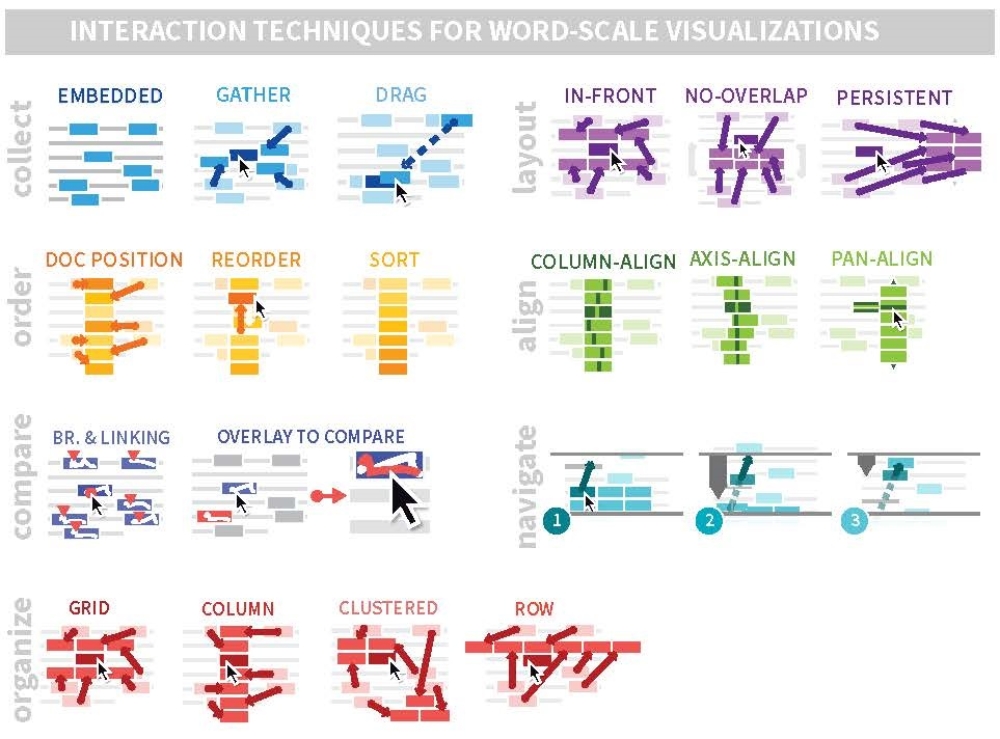
Word-sized visualizations can be placed statically or dynamically in a document and above, next to or on top of the word itself, depending on the intended use [Goffin et al. 2014]. In dynamic integration, interaction plays an important role and, if required, a larger version of the word-sized visualization can be displayed next to or below the text [Beck and Weiskopf 2017, Latif et al. 2018, Latif and Beck 2019] or all word-sized visualizations can be combined as a list or table to allow comparisons [Goffin et al. 2020]. For the display of a larger version of the word-sized visualization there are different possibilities for placement. For example, they can be displayed as a space-filling overlay, as a tooltip, integrated into the text or in a specially assigned position (e.g., at the margin). For interaction to combine word-sized visualizations, there are different interaction techniques (collect, order, compare, or organize) and layout options (as a table, in a row, in a column etc.).
Application Example 1: Eye Tracking
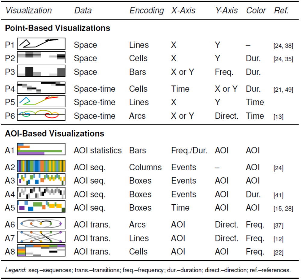
Eye tracking data can be arranged as word-sized visualizations for analysis purposes, e.g., in a comparison table (see Beck et al. 2016) or integrated into the analysis report for discussing the results (see Beck and Weiskopf 2017). There are a large number of word-sized visualizations [Beck et al. 2017], which can be divided into point-based (e.g., fixations) and AOI-based visualizations.
Point-based visualizations can represent the x- or y-position of fixations as a connection of lines as a scanpath, or the aggregation of fixations at a specific area of the stimulus as an attention map. Another type of word-sized eye tracking visualization can show the frequency of x- or y-position of fixations as a bar graph. If the temporal component of the eye tracking data is to be integrated into the visualization, time can be plotted on the x-axis and the y-axis of the word-sized visualization can again represent either the x- or y-position of fixations. Another option is to color the scanpath based on time (from blue (start) to red (end of scanpath)). Also, circular arcs can be used to depict the progression of the x- or y-position of the fixations over time (color coded).
To display AOI-based data, various statistical information (e.g., average duration within an AOI) can firstly be visualized as a bar chart. Another possibility is to display the temporal order of AOIs differently (as columns or as boxes). Here, the y-axis can be used to assign each row to an AOI. The boxes can also be scaled based on the AOI dwell time as well as colored to visualize the AOI or time. For the visualization of transitions between AOIs, arcs or lines can be used as well as a matrix representation
Application Example 1: Social Media
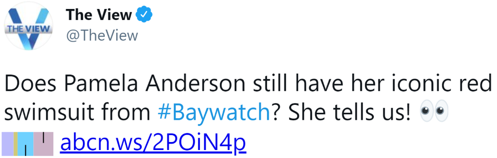
In social media, we can employ word-sized visualizations to inform people on discussion diversity and context changes, as a form of casual analytics. We can embed word-sized visualizations in each micropost and show, for example, in which contexts topics, news articles or hashtags -- so-called digital fragments – are discussed and how the micropost relates to that discussion, without having to leave the social media feed.
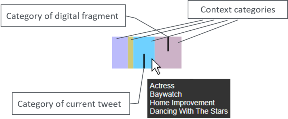
Embedding word-sized visualizations into social media posts opens up a wide range of analytic possibilities, including demonstrating discussion diversity through topics, sentiment or discourse and their development over time. It can enable people to place individual social media contributions in a larger context and give ways to escape their filter bubble.
Small-scale Visualizations
Small mobile devices such as fitness trackers, smartwatches or mobile phones enable people to interact anywhere and anytime with real-time visualizations of data collected by physiological sensors, for example, when sitting on the bus, walking or running, at home or in the supermarket, outside and inside buildings. This usage context is different from desktop usage, and with the minimal space for data displays inherent in mobile devices, especially smart watches and fitness trackers, interesting new challenges for visualizations arise.
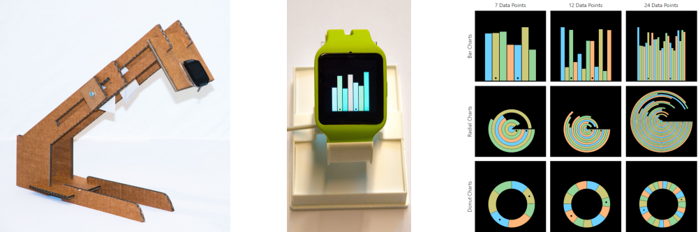
Application Example 1: Smartwatch
How quickly can a person complete a particular task using visualization on a smartwatch? This question is the focus of research on small-scale visualizations displayed on smartwatches. The answer to this question depends on the specific task and visualization. For example, on average a person can solve the task, which of two marked elements in a bar chart or donut chart is the larger one in less than 300 ms. In the case of a radial bar chart the average time is already higher (~1800 ms). The goal in developing visualizations for smartwatches must, therefore, be to find the appropriate visualization for the task at hand.
Furthermore, the question arises, what or how much information can be shown on the display of a smartwatch? In addition to the time, modern smartwatches also display various data such as heart rate, number of steps, calories burned, or battery level. However, what information and how fast can people absorb this information? And which data do people want to see besides the time? In a survey, Islam et al. (2020) found that usually between 3-5 data elements are displayed next to the time and these data elements mainly represent health and fitness data. The most popular display type is a combination of icon and text. However, there are still many interesting possibilities how visualizations can be displayed better on the smartwatch face.
Application Example 2: Fitness Tracker
What types of visualizations do people want to see representing their sleep data? In a large survey, Aravind et al. [2019] has investigated this question and wanted to know, which visualizations are used to display sleep phases and sleep duration for the last night, for a weekly as well as monthly overview, and a social comparison. There were some differences whether the visualization was displayed on a smartwatch or a fitness tracker, however, often a form of bar chart was chosen as a favorite. Now the question arises whether these visualizations are also well suited, whether there are differences between the display on a smartwatch and a fitness tracker, and whether a horizontal or vertical display on a fitness tracker is more suitable.
