Visualising dynamic graphs in particular for larger data sets and when additional information is available such as a hierarchical organisation of the objects is a challenging task. Many data dimensions have to be represented at the same time:
- the graph vertices (objects)
- the edges induced by the graph (relations)
- the weights of the edges
- the inclusion edges induced by the hierarchy
- the evolution of the graph over time
State-of-the-art report
We surveyed the field of dynamic graph visualisation in a EuroVis 2014 state-of-the-art report (STAR). More than 120 papers have already been published in this growing field of research, among them about 60 unique visualisation techniques. We classified the techniques into a simple hierarchical taxonomy and made our literature collection also available as an interactive database.

|
Animated node-link diagrams
Traditional approaches use a time-to-time mapping and show time-varying graph data as animated sequences of node-link diagrams. Though this visualisation strategy is very intuitive, it also has some drawbacks:
- if the graphs are very dense, i.e. have many edges, visual clutter occurs caused by many edge crossings
- animation leads to cognitive efforts for a viewer to preserve his mental map
- sophisticated layout algorithms are needed to circumvent the two former mentioned problems that have a high runtime complexity
Timeline-based diagrams
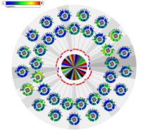
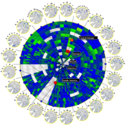
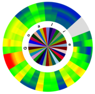
In our research, we avoid a time-to-time mapping and encode the time dimension into space instead. We use stacked graphical colour-coded elements to show weighted time-varying relations and we show links only implicitly by different orientations instead of direct explicit links as in node-link diagrams.

|

|

|
Our approach allows easily exploring a time-varying graph data set for trends, countertrends and anomalies and has many benefits:
- visual clutter is reduced by showing the links implicitly
- cognitive efforts are reduced and the mental map is preserved by using static images
- interactive features can easily be applied
- run time complexities are reduced and graphs can be added on-the-fly.

